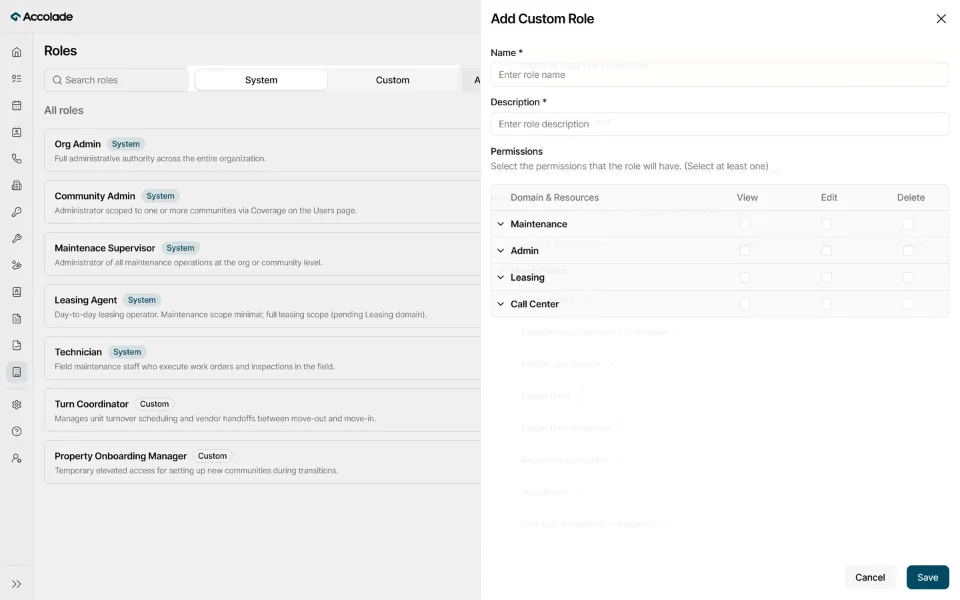
Making immersive shopping easier for brands to create
Designing the end-to-end UX of a 0→1 immersive commerce platform that helps luxury brands create, customize, and manage virtual shopping experiences through guided workflows.
- Role
- Freelance UI/UX Designer · Founding Product Designer
- Timeline
- February 2024 – February 2025
- Industry
- E-commerce · Immersive Commerce · B2B SaaS
- Platform
- Web application
- Focus
- Competitive Analysis · Information Architecture · End-to-End UX · Interaction Design · Design System Foundations
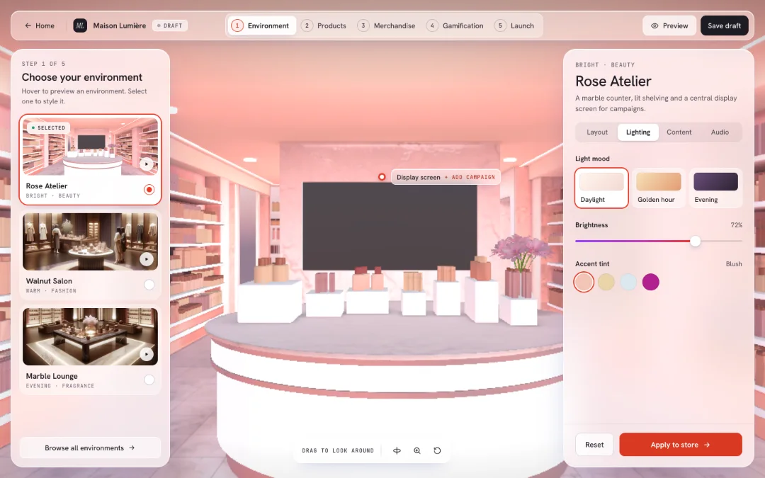
Making immersive commerce accessible to brands without technical expertise.
A London-based technology company was building a platform that allowed luxury brands to create and manage interactive 3D shopping experiences.
Creating a virtual store involved several connected workflows, from onboarding and product uploads to environment customization, subscriptions, and publishing.
- 01 Onboarding
- 02 Product uploads
- 03 Environment customization
- 04 Subscriptions
- 05 Publishing
The challenge was to make a technically complex experience feel simple enough for brands to manage independently.
As the founding Product Designer, I worked closely with the CEO, Product Manager, and engineers to shape the platform from its earliest stages. My focus was the product's UX, not developing or modeling the 3D environments.
Designing the complete journey, not isolated features.
I started with competitive analysis, studying how other e-commerce and immersive commerce platforms showcased their features, organized workflows, and guided users.
Using these insights, I worked on the information architecture, user flows, and interaction design for the platform, connecting store creation, product management, environment customization, and publishing into a cohesive experience.
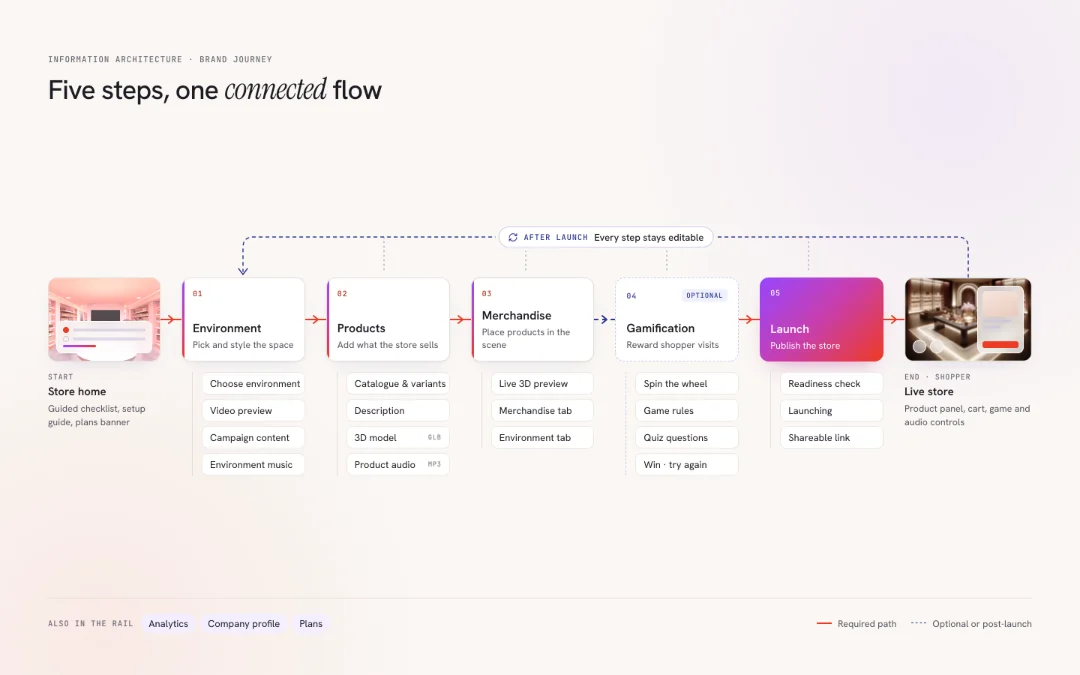
As the product evolved, I continued refining workflows and reusable UI patterns to maintain consistency across the experience.
A more capable product shouldn't become a more complicated one.
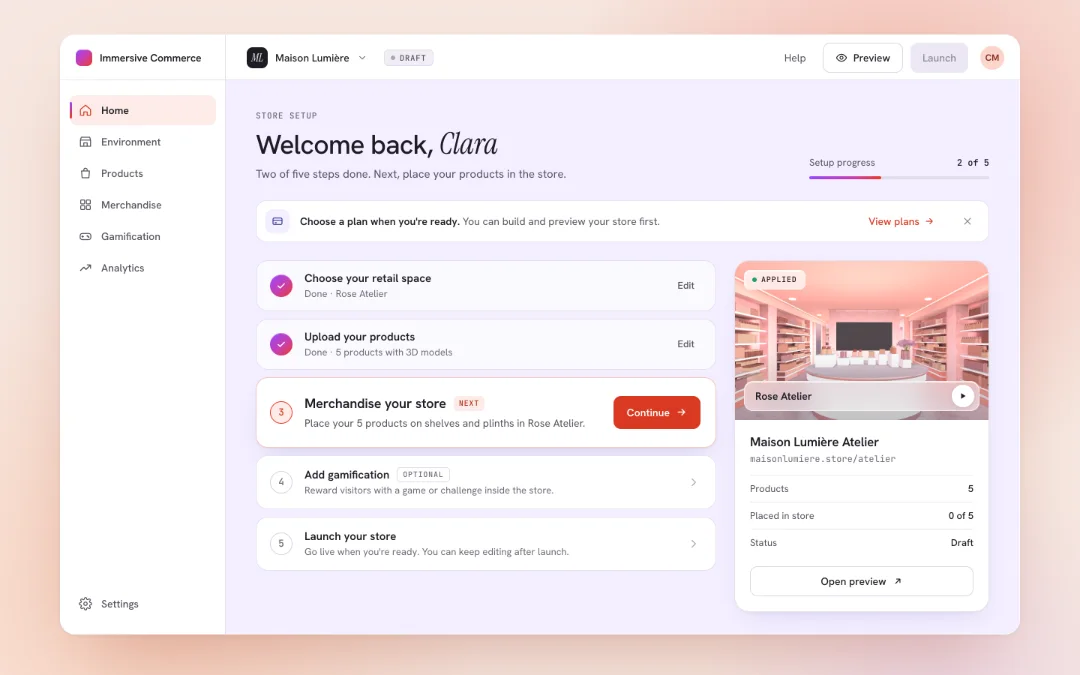
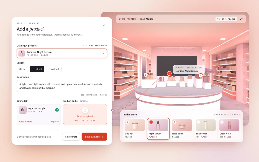
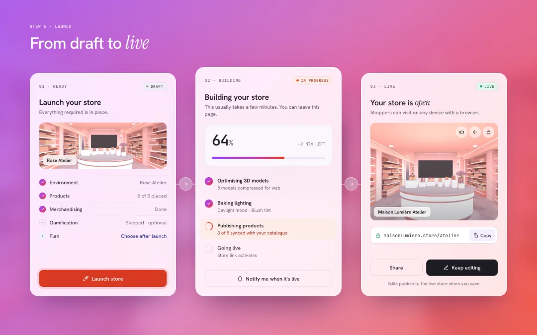
We asked users to subscribe before creating a store. I questioned why.
Our initial flow required brands to choose a subscription plan before they could begin creating their virtual stores.
I identified a potential point of UX friction: we were asking users to commit before they had experienced the platform's value.
I raised this concern with the CEO and Product Manager and suggested reconsidering where subscriptions appeared in the journey.
Following our discussions, we changed the placement of the subscription decision in the flow.
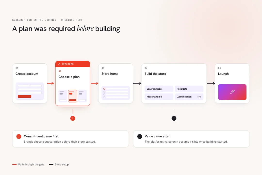 BEFORE
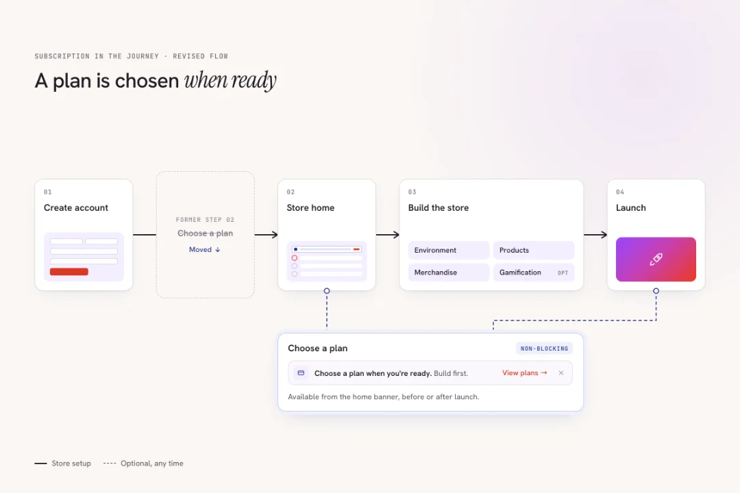 AFTER
Not every business requirement needs to become the user's first step.
Establishing design foundations as the product grew.
As the platform expanded, I worked on reusable UI components, styles, and interaction patterns to create a consistent experience across its different workflows.
These design-system foundations helped maintain continuity as we introduced new features and refined existing ones.
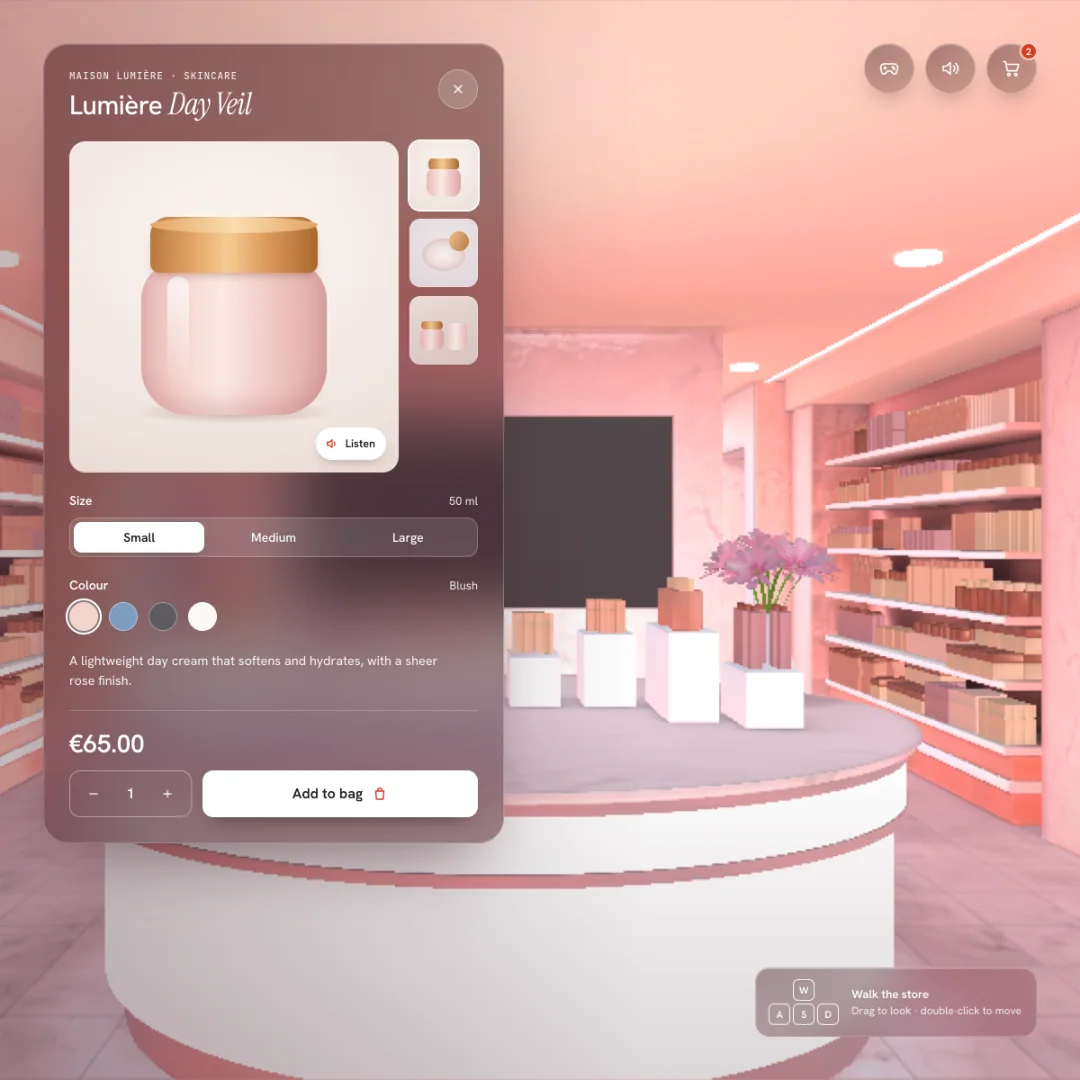
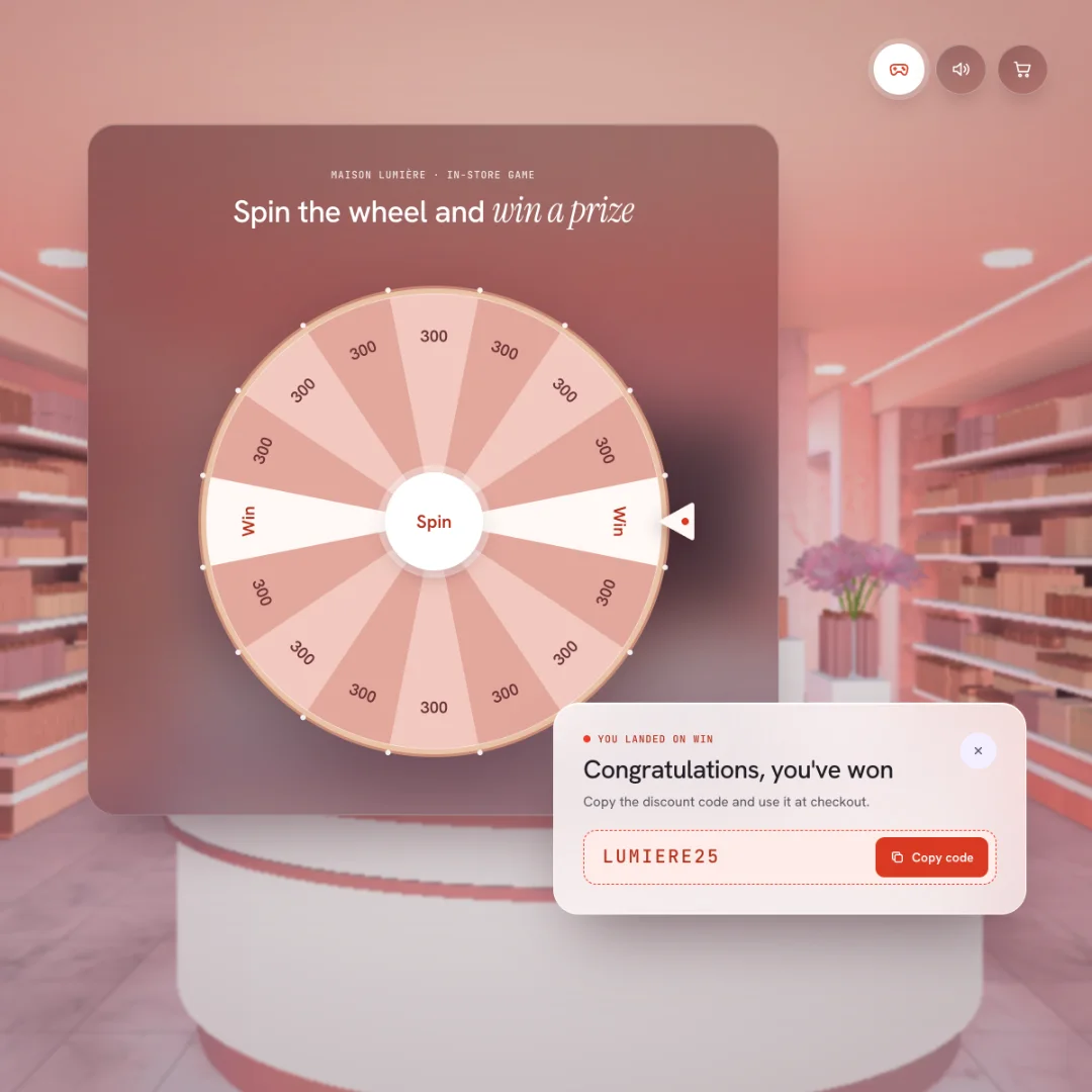
Beyond the platform
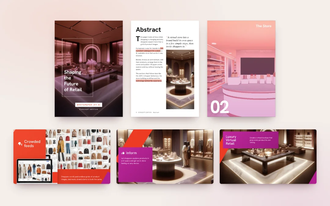
My work also extended beyond the platform to the company's website, branding, pitch decks, and customer-facing experiences.
Working across both the business tools and customer experiences gave me a broader understanding of how product decisions connected to the business.
From an early idea to a connected commerce platform.
Over the course of the project, we shaped an end-to-end experience for brands to create, customize, publish, and manage virtual stores without developing the underlying 3D technology themselves.
- 0→1 product design
- competitive analysis
- information architecture
- user flows
- interaction design
- iterative prototyping
- reusable design foundations
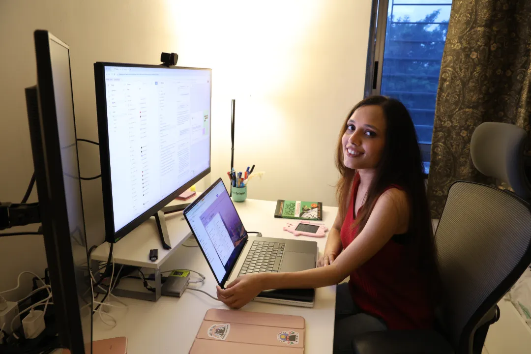
The experience taught me that designing a product from scratch isn't about solving every feature independently. It's about making different capabilities work together in a way that feels natural to the people using them.
No user testing, adoption figures, conversion metrics, or revenue impact are claimed.